
Braillerunner
Gamifying the experience of learning Braille on mobile
Platform: Mobile
Role: UX/UI Designer, User Researcher, Art Direction, Composer
Project Type: Design, Research, Audio UX
Industry: Edtech, Accessibility, Gaming
Tools: Figma, Descript, Zoom, Photoshop, Logic Pro X
Braillerunner Theme Song


Your Braillerun is about to begin!
Are you ready?
Background:
I spent over 10 years in the blindness ane low vision non-profit sector at the LightHouse for the Blind and Visually Impaired. Toward the end of my tenure, I joined in the organization’s Media and Accessible Design Lab - where we produced Braille and tactile maps and graphics.
There I started learning to read and type Braille using UEBonline. I got hooked - it brought me back to my elementary school days learning to type on a QWERTY Keyboard in the computer lab using tools like Microtype and Mario Teaches Typing. Gamified learning like this pushed my friends and I to improve our skills.

Microtype (1992)

UEBonline (2026)
What is Braille typing?
A Braille keyboard uses six buttons that correspond to the six dots in the braille cell. When more than one button at a time is pressed, the keyboard triggers all of those dots simultaneously.

Invented in the early 1950s, the Perkins Braille typewriter is still widely used today. The two sets of three keys surrounding the center button are used to type individual letters.

A modern, affordable Bluetooth Braille display by Orbit Research. The two sets of three top buttons mirror the Perkins input keys.

This is what Braille Screen Input looks like on iOS

An early proof-of-concept mockup we made to test the visual distribution of both Braille typing buttons and other graphical elements.
The Problem:
Educational resources for learning Braille typing on iOS are surprisingly limited.
Several thoroughly gamified practice tools (like UEBonline and Accessibyte) are effective, research-backed tools for learning Braille, but avoid using BSI (Braille Screen input) on iOS directly. Instead, they focus on the desktop and external keyboard typing experience.
The ones that do teach typing on iOS rely on existing Voiceover and Braille skills - they don’t start you from scratch.
Meet Gabriel and Magdalena:
Different users, similar needs
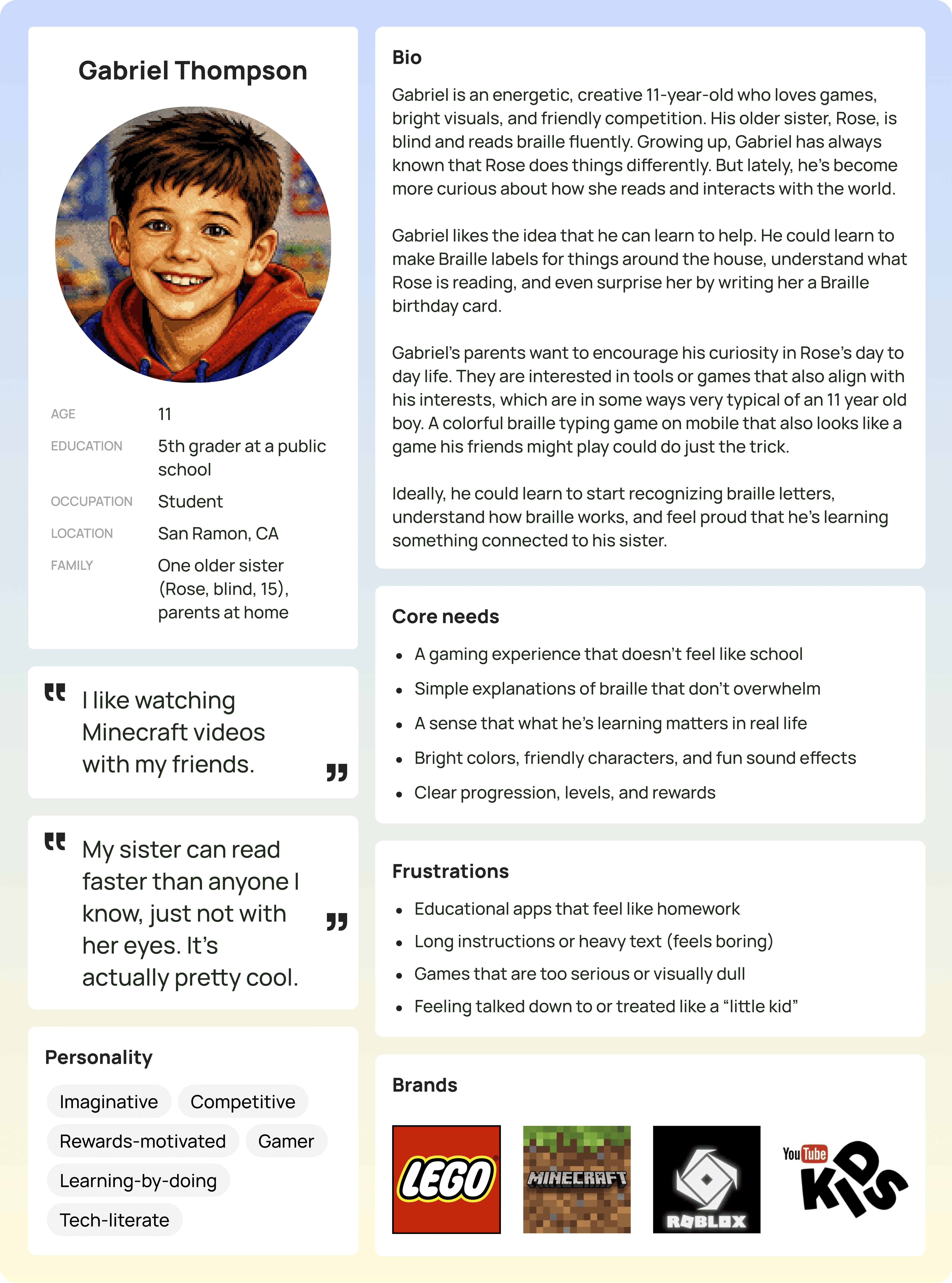
Gabriel (11 year old, his older sister is blind)
How might we help Gabriel learn more about his sister’s life in a way that plays into his existing interests?
Read More About Gabriel
Gabriel’s older sister is blind, and he is reaching an age where he is starting to be actively curious about the world around him. His parents want him to get to know how his sister navigates her life and learns new things, so that the two of them can share a closer bond. He watches video on YouTube Kids, plays Minecraft with his friends, and is developing an interest in old school / retro video games.

Magdalena (Teacher of the Visually Impaired)
How might we help Magdalena keep her Braille skills sharp in a way that doesn’t feel exhausting or overwhelming?
Read More About Magdalena
Magdalena learned to read and type Braille in school, but that was over 15 years ago. Many of her students have low vision, or multiple disabilities. She is assigned a Braille-reading student every few years, and then needs to re-sharpen her Braille skills to meet that student’s needs. Her life is very busy - juggling a large caseload with multiple students in different schools in her district. She travels constantly, and has two kids at home who demand her attention when she gets off work.
Problem Statement - Both Personae or anyone who might be interested in learning Braille
How might we help ANYBODY learn more about Braille in a way that doesn’t feel like school or a burden on their time?
Read More About Any Curious User
Generally speaking, people know about Braille and have a vague idea of how it works. But by and large, sighted people don’t know the Braille alphabet or how the dots in a Braille cell are constructed, and how words or numbers are written - - our user interviews reinforced this. Some sighted people work tangentially with Braille spaces - like architects and facilities managers who need to install ADA accessible signage in their buildings. But because they were never taught this in school, they are left figuring it out on their own.
Feature Roadmap:
Start small, but get it right
We would build out the full learning experience -from lesson instruction to testing your knowledge, establishing a pattern for learning new letters and practicing to type them.
At the same time, the scope of this project needs to be appropriately narrow so that its mechanics can be fine-tuned and solidified. We should start with just a few letters and test that approach with users to make sure they enjoy themselves and are actually learning.
Audio or haptic feedback would be a nice to have, as that can help immerse the user in the world and provide an additional layer of accessiblility too.
Sitemap, User, and Task Flows:
Blueprints for Braille learning
Our sitemap functions as a top level overview of the menu structure; we got into the nitty gritty details in the user and task flows (below)

Our user flow takes that sitemap and shows in more detail how each screen will move into the next.


Our task flow is threefold. The end of one feeds directly into another, and showcases a full lesson from start to finish.
And the winner is…..
We settled on Braillerunner for a few reasons:
The play on "trail running" was just irresistible. As an added bonus, it reminded us of Temple Run and the fast-paced mobile games of the early 2010s.
The 90s retro nostalgia aesthetic also caters to both our target personas:
Current teachers of the visually impaired like Magdalena in their mid-30s to 40s who learned to type in the 90s on blocky, pixelated programs.
Modern elementary school kids themselves, whose popular media also includes a modern resurgence of the lo-res, old school game aesthetic (found in games like Undertale and Minecraft).
UI Kit
Our final UI kit expands upon the style guide, including revised fonts, colors, our full library of hero character assets, as well as additional icons, components, and graphics.


Audio Kit
We also composed original music and sound effects for Braillerunner in a 90s video game / chiptune style. This music was created in Logic Pro X using a the ES2 synth, Arturia Microfreak, and a Game Boy sound sample pack. You can explore those sounds below.
Braillerunner Theme Song
Success Sound
"Uh oh!" Sound
Iterations:
User rewards and eye candy
26 Screens added. Most are interaction-oriented to give the user a clearer picture of how their button presses impact the experience.. We also added are coin/reward screens (after each lesson), and a checkered flag style countdown before the Braillerunner Race begins.
Added a Coin / Token Reward System
Each coin is called a Louie (named after Louis Braille). I was inspired by Canadian currency here - loonies and twonies.

Original

Note the new hamburger menu (top left), new coin counter system (top right), and additional stroke around pressed buttons which makes them easier to see.
Braillerun / countdown timer added
Two users were surprised that the Braillerun started so quickly - so we added a "checkered flag" racing-style 3-2-1 countdown to get the users ready for their speed-based typing run.

Read the Full Iterations Report